[Caine/robbiethepainter/Yunsil] Gus Fring (SHIPPING)

Custom One-Sixth Figures Forum

Help Support Custom One-Sixth Figures Forum:

This site may earn a commission from merchant affiliate links, including eBay, Amazon, and others.
Re: [Caine/robbiethepainter/Yunsil] Gus Fring (Collecting Deposits - Due July 1)

Thanks for the update[emoji1417] What body are y'all planning on using?


Sent from my iPhone using Tapatalk
 
Re: [Caine/robbiethepainter/Yunsil] Gus Fring (Collecting Deposits - Due July 1)

Can anyone confirm whether the pants are black or dark navy?

Sent from my SM-N920W8 using Tapatalk
 
Re: [Caine/robbiethepainter/Yunsil] Gus Fring (Collecting Deposits - Due July 1)

It's black.

image.png
 
Re: [Caine/robbiethepainter/Yunsil] Gus Fring (Collecting Deposits - Due July 1)

I have an exciting update to share. My initial thought is that the blue is not dark enough. The white vertical lines are good in the pattern but the horizontal white lines are not really there. I'll post the new pics when I have them but I'd like to hear your thoughts.

"I finished your project.

but I didn't take a picture.

I will show you photo*again in natural light.

Attached file is in flash.

so, You cann't *see* real color in photo.

Thank you"


RK70rf5.jpg


Sent from my SM-N920W8 using Tapatalk
 
Re: [Caine/robbiethepainter/Yunsil] Gus Fring (Proto Update)

Awesome result!
It's weird that she's working on new projects before the old ones!
But all looks good here.
 
Re: [Caine/robbiethepainter/Yunsil] Gus Fring (Collecting Deposits - Due July 1)

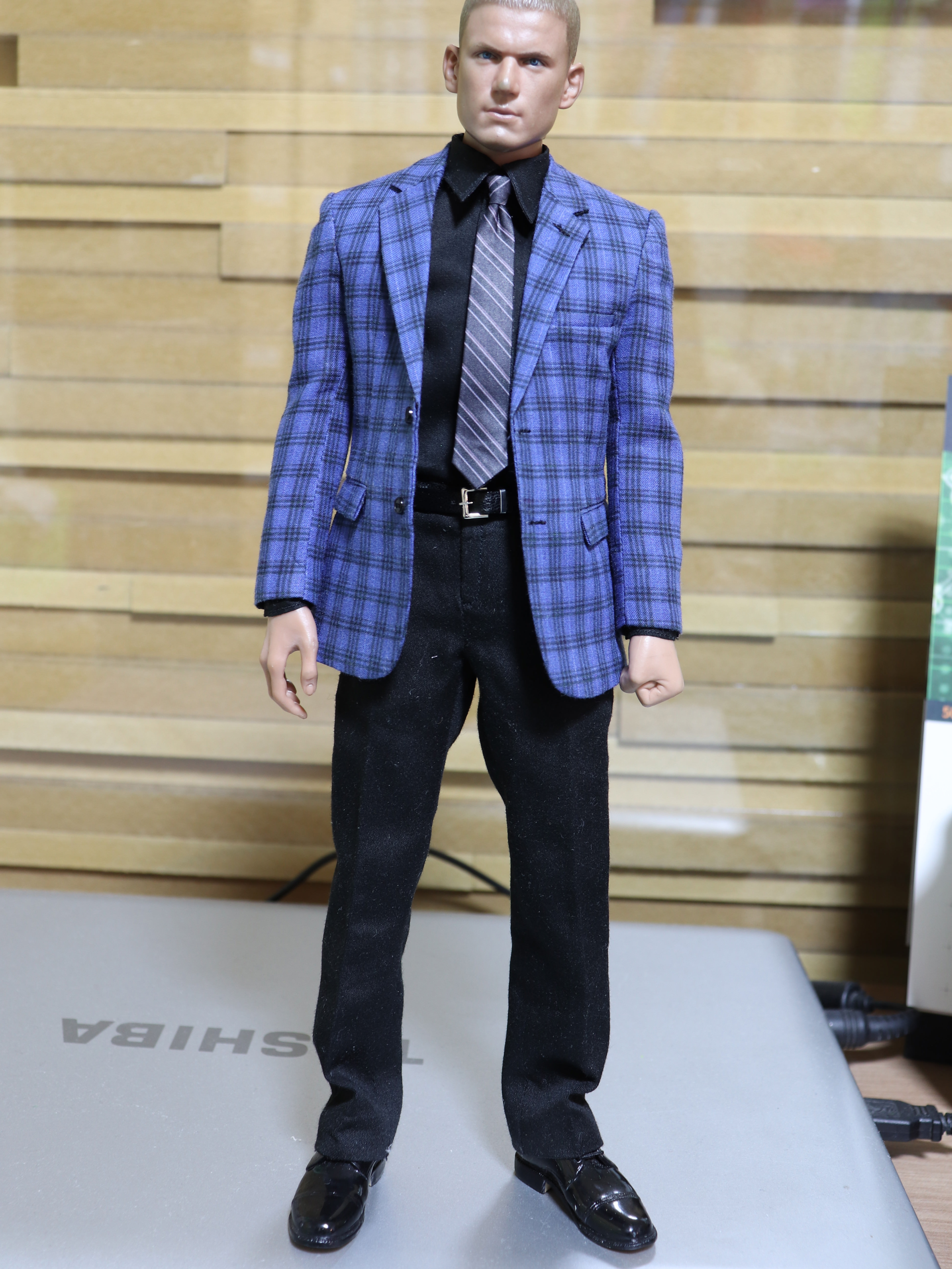
I agree also that this is not dark enough!
 
Re: [Caine/robbiethepainter/Yunsil] Gus Fring (Proto Update)

Awesome result!
It's weird that she's working on new projects before the old ones!
But all looks good here.

I know! What the heck?! But, the patterning and color seems more simple than other projects.
 
Re: [Caine/robbiethepainter/Yunsil] Gus Fring (Proto Update)

I agree, it would look better darker blue.


Sent from my iPhone using Tapatalk
 
Re: [Caine/robbiethepainter/Yunsil] Gus Fring (Proto Update)

Thanks for the update. Look forward to seeing better pic but does appear blue is too light.


Sent from my iPhone using Tapatalk
 
Re: [Caine/robbiethepainter/Yunsil] Gus Fring (Proto Update)

I agree the blue looks a little light, more like that wrong jacket look-alike posted on the previous page. The tonal contrast between the blue and black lines on the screen used jacket didn't seem as great as they do in this proto. But the tailoring looks great.
Yeah I think the proper blue color will fix the contrast

Sent from my SM-N920W8 using Tapatalk
 
Re: [Caine/robbiethepainter/Yunsil] Gus Fring (Proto Update)

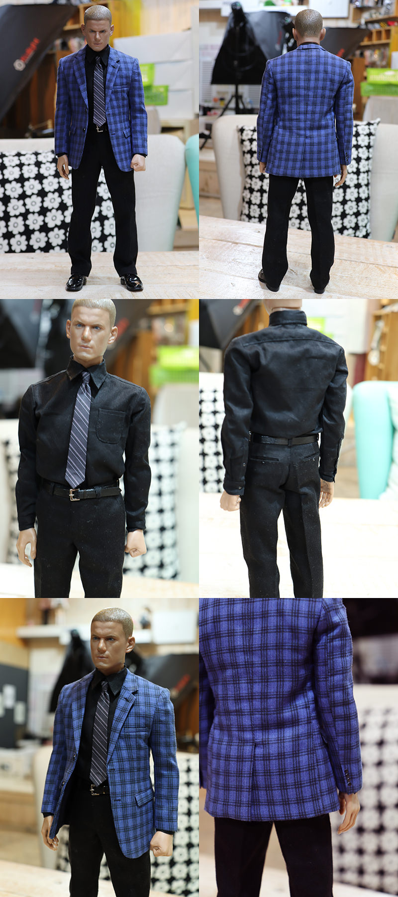
Update:

Please check detail.

* Necktie - I think color is little bright.
Neck tie fabric is shine. so, black seem to gray.
I try to fabric print on no shine fabric.

*Jacket fabric - I used to very thin fabric for jacket.
because It is thin fabric in inreferance(Please see a attached file)
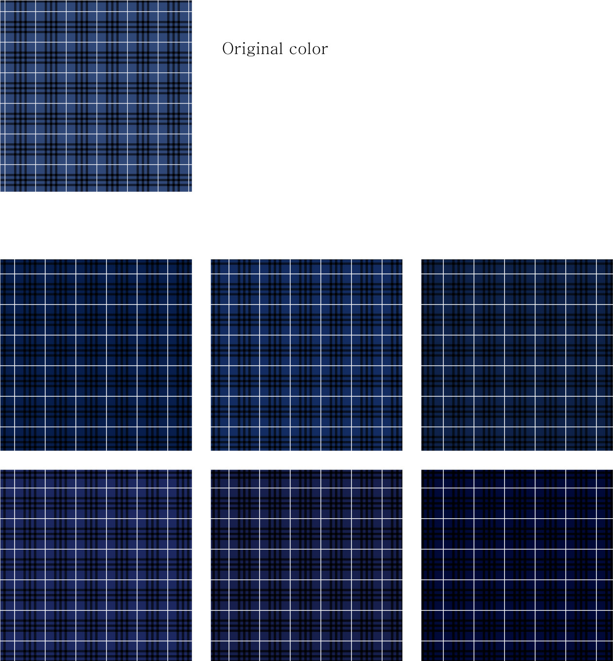
and color is too bright. I agree with you. so, I ordered 6 type color sample. (jacket color.jpg)
I think It will arrive in this week. I will show you.

Please tell me to fix thing.

Thank you.

Keu6Fhw.jpg

5fedLYT.jpg

EnSkGMi.jpg
 
Re: [Caine/robbiethepainter/Yunsil] Gus Fring (Proto Update)

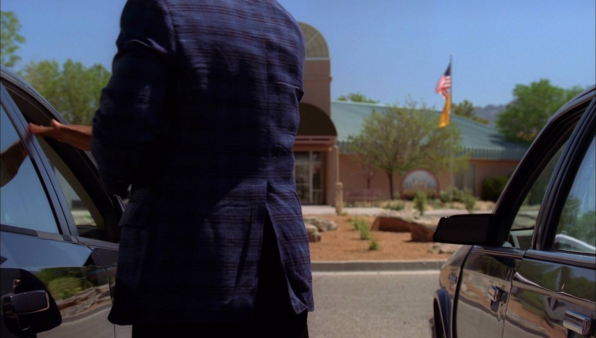
**Initially** I went to darker squares because that’s what we all agreed on earlier. 1 and 5 at first BUT looking at the shot from the show, I’m inclined to like box 4. The reason is the visibility of the black lines within the blue. If not, maybe 2?? Personally ok with either.


Sent from my iPhone using Tapatalk
 
Re: [Caine/robbiethepainter/Yunsil] Gus Fring (Proto Update)

Thanks for the update. I vote for the first column second row for the jacket color. The necktie is a little bright, not sure if that's from the shine of the fabric so would be nice to see that on the no shine fabric as discussed.


Sent from my iPhone using Tapatalk
 
Re: [Caine/robbiethepainter/Yunsil] Gus Fring (Proto Update)

This is how I suggested 4 and 2. (Anybody else see black dots between the boxes)[emoji15]
dce1e590ef899fb875a9970368f768cc.jpg


Sent from my iPhone using Tapatalk
 
Re: [Caine/robbiethepainter/Yunsil] Gus Fring (Proto Update)

This is how I suggested 4 and 2. (Anybody else see black dots between the boxes)[emoji15]
dce1e590ef899fb875a9970368f768cc.jpg


Sent from my iPhone using Tapatalk

I agree. 4 looks most accurate and preserves the visibility of the pattern the best in my opinion.


Sent from my iPhone using Tapatalk
 
Re: [Caine/robbiethepainter/Yunsil] Gus Fring (Proto Update)

I agree guys. #4 looks promising.
 
Back
Top