Oh, ok then.

Maybe you should mark that in the post so no one else gets the wrong idea.
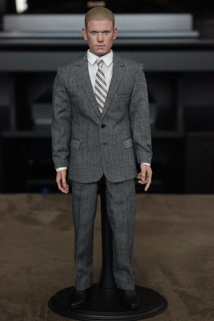
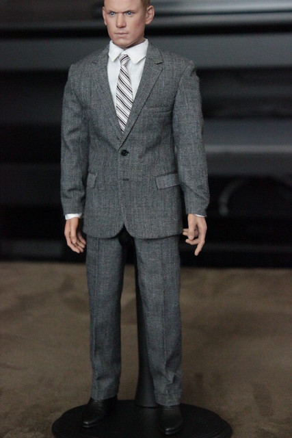
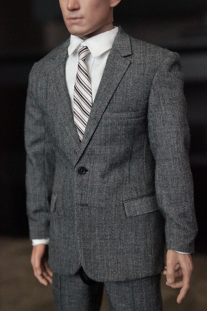
Can you take a full-length photo showing the suit from each side and a couple at about 45 degree angle, one facing forward and one facing away from the camera?
Here's the list you posted earlier last week:
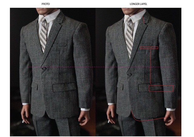
- Longer lapels
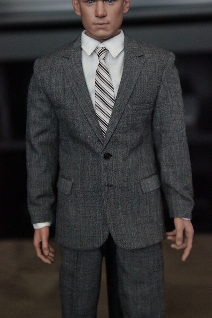
- Jacket chest pocket placed lower with wider opening
- Lower jacket pockets and darts pushed back a little.
- Wider opening on shirt sleeves
- Lapel line break more vertical
- Add prong and holes to belt
Let me add the following, which compliments and adds to the above:
- Belt loops need to be thinner in width and flatter to the pant
- Jacket chest pocket - make sure the rectangle not be overlapped/covered by the lapel and proportions width:height are correct
- Lower jacket pockets need to be pushed back more than a little.

On the 1:1 jacket, the spare between the front edge of the pocket and the suit edge looks almost the same as the width of the pocket itself.
- Verify the height of the space under the jacket pockets relative to the width of the pockets
- Concurring with Jake, arms on jacket looking a bit thick around the elbow area - verify the taper of the arms against 1:1 suit
- Any chance for smaller buttons on the front of the jacket?
- Jacket doesn't look long enough (which has been mentioned before)
- In a similar vein to the taper of the arms, the pants should also have a visible taper which is authentic to the period (side photos will help check this)


