[Iminime] A trio of GoodFellas

Custom One-Sixth Figures Forum

Help Support Custom One-Sixth Figures Forum:

This site may earn a commission from merchant affiliate links, including eBay, Amazon, and others.
The mouth area needs a little work. Pesci always looks like he's sucking on a mint. Still think it looks pretty good as-is and a paint-up would be the best way to gauge accuracy.

Joe-Pesci_Tommy-De-Vito.jpg


tommy-goodfellas_20110413020128.jpg


PESCI_JOE_-_Goodfellas_1990_t423x600.jpg
 
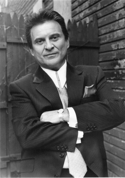
The first thing I noticed is that in the film, Pesci's forehead is not that big, the hair is lower on the forehead. Also, the hair coming down the side and blending into the sideburns (in front of the ear), should be almost straight down, angled back just a little. In the proto, you can see it comes distinctly down to a point and then angles back. Also, his top lip doesn't have much shape to it, it is more broad. The proto has quite a bit of curvature.

You can see the hair pretty well in this photo.
 

Attachments

  • image.jpg
    image.jpg
    70.2 KB
We found no photos of his smirk, I think we will stay on the expression but found some areas to improve

thanks

Denny
 
I think just a generally less stern expression would go along way on the Peschi sculpt, still think a smirk would be great but if thats not the direction this goes then the current expression could work with some tweaks. Great start though
 
Less a smirk and more of a very slight expression with the mouth. He doesn't need a full on Tyler Durden smirk. I am thinking more along the lines of pictures 2 and 3 posted above.
 
The first thing I noticed is that in the film, Pesci's forehead is not that big, the hair is lower on the forehead. Also, the hair coming down the side and blending into the sideburns (in front of the ear), should be almost straight down, angled back just a little. In the proto, you can see it comes distinctly down to a point and then angles back. Also, his top lip doesn't have much shape to it, it is more broad. The proto has quite a bit of curvature.

You can see the hair pretty well in this photo.

Great suggestions!

Sent from my GT-I9300 using Tapatalk
 
I fell behind on this but finally caught up. The sculpts are looking fantastic! A couple minor tweaks here and there to the Henry & Tommy sculpts but they're near perfect. I think that Jimmy is dead on! Holy moley!!

I have to respectively disagree with you guys on the smirk for Tommy though. I don't think that it's a fitting expression for the character as far as a sculpt goes. Sure, he laughs in the movie and cracks a smirk here and there but most characters make many facial expressions throughout a film. I don't feel that a smirk is synonymous to his character the same way it is for a Tyler say. If you have to pick one expression that suits a sculpt, I think the current one is good; stern and tough.

For De Niro I think that black hair is the way to go, not end of the movie older Jimmy.
 
Are different bodies being explored to convey the different heights and physiques? I think that Henry is the easiest because he's tall and slim-average so he'll be perfect on the ZCWO regular body. Tommy is tiny next to the other two so a Slim with a fat suit would do the trick (if there's a way to give him shoes that absorb height, where the foot peg connects deep in the shoe, then that could even shave another 1/4" off him). Jimmy may be the hardest to figure out. He's shorter than Henry but taller than Tommy
 
I agree, Jimmy definitely needs to be the darker haired middle of the movie look. For Tommy, his character had two extremes, the funny guy when he was with Henry, especially trying to impress a girl, and the serious look when he wanted respect, which was most of the movie.
 
Yup. Serious/neutral looks are fitting for these characters. It's not like they are really animated or have any specific emotion or personality that stands out so much and needs to be conveyed thru the sculpt like a Torrance, Tuco, McClane, Durder or characters of that nature.
 
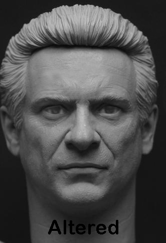
Since you were asking for suggestions on possible improvements here's my thoughts.

* Thin out the bridge of the nose and make the overall nose smaller but more importantly the tip a little longer/pointier.

* Make the forehead and brow lines less visible (although I'm aware the casting process can help with this).

* Make both the upper and lower lips thinner.

* Possibly add a little more body to the sides of the hair and give it a more square appearance.

People may think differently but I think those are a few things throwing it off, here's my quick alter in PS.

6Mmd1KP.jpg


Original.

attachment.php
 
Last edited:
Since you were asking for suggestions on possible improvements here's my thoughts.

* Thin out the bridge of the nose and make the overall nose smaller but more importantly the tip a little longer/pointier.

* the brown lines (although I'm aware the casting process can help with this).

* Make both the upper and lower lips thinner.

* Possibly add a little more body to the sides of the hair and give it a more square appearance.

People may think differently but I think those are a few things throwing it off, here's my quick alter in PS.

6Mmd1KP.jpg


Original.

attachment.php

Bravissimo-altered is real Pesci!Maybe nose tip even sharper.

Sent from my GT-I9300 using Tapatalk
 
Back
Top