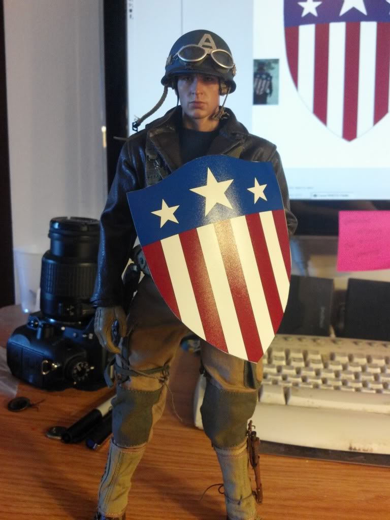
As many are finding out HT's Rescue Capt is a brilliant figure. But one thing that is a problem for some is the size of the shield. So I thought I would see if there is interest in a better shield. Im looking at two different version.
Version #1
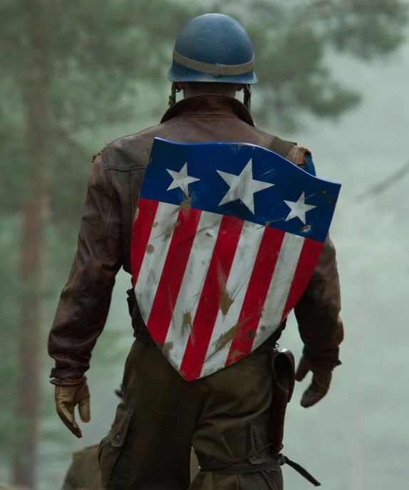
This would be the correct size and look of the movie version. Not only would it be the correct size but also I wanted to make it a really nice piece on its own merits. As many know, the movie version appears to be made of metal, so my hopes for this would be that the whole thing is made of brass at it appears in the movie based on shots of the back of the shield. The straps would be made of leather.
Version #2
This would be based on the punch from Red Skull. It would also be the correct size and shape of the movie but instead of metal, it would be made of resin. I dont have the facilities to make it from metal. Sorry. It would be painted to look like brass on the back. Better then the version we got from HT. It too would have leather straps on the back.
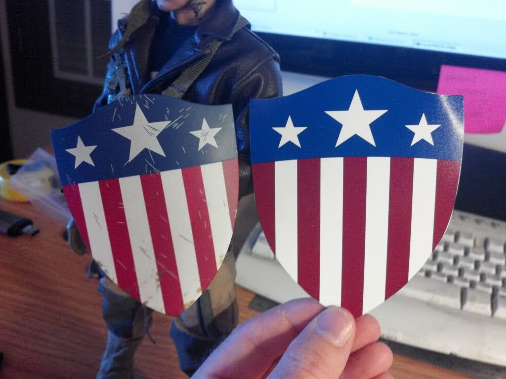
Both version paint apps would match the movie version much closer then HT's. Correct weathering and colors.
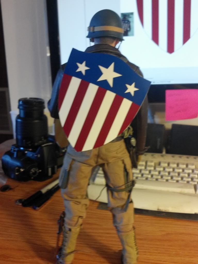
Here is a mock-up of the size and basic paint layout (not a color sample). Looking at it I think it needs to be a little more narrow but the length is right.
