Thanks so much, Ray! Really appreciate the nod. *need my little bow emogi here*
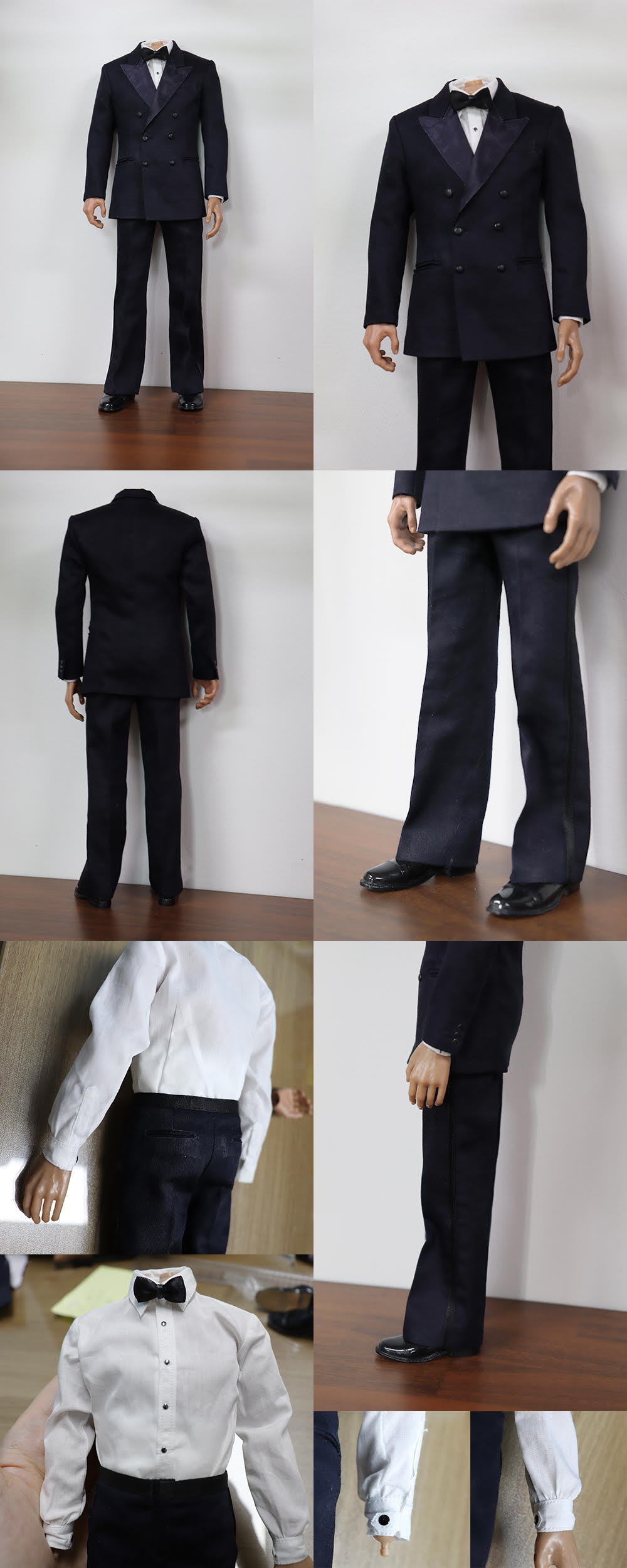
I was reviewing the details too and its amazing the little details she caught.
Regarding the slight sheen on the tux, as long as it doesn't compete with the obvious sheen of the lapel I'm all for it. But like you, I'm fine without it too.
The only thing I did notice was that I believe the button placement could be slightly lowered. It seems perhaps the folded lapel should also come down a little further on the middle button.
Here's a comparison that might help show this more clearly.
As you can see, I believe the pocket placement is perfect, just the buttons could be lowered a bit. Hopefully this doesn't make the jacket itself to appear shorter at the bottom. My red lines are not necessarily accurate but you can see the space between the bottom button and the pocket which best demonstrates the point. Once you get the bottom button set correctly, the middle buttons just need to be placed evenly between the top and bottom row.
Maybe Ray or Mike can cross check me here to make sure I'm seeing this correctly.
And here's the full shot again to show the balance of the lapel that comes down to the mid-button which looks to be about to or just above the high pants line on Moore. The lapel seems to come right down to roughly the middle of the jacket.


