- Joined
- Aug 5, 2015
- Messages
- 715
- Reaction score
- 293
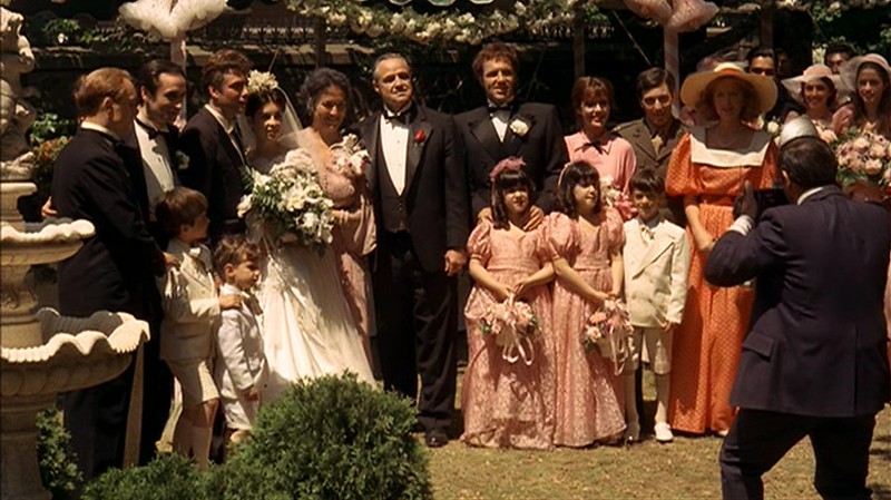
Re: YUNSIL- Vito Corleone tuxedo COLLECTING BALANCE PROTO SHOWN!
Remaining balance paid Chile, many thanks!
Remaining balance paid Chile, many thanks!

FIRST PROTO EVERYONE!!
I think it looks tremendous. A nice suprise was that yunsil wasnt satisfied with the HT fat suit, so she made a new one for us! Please chime in with any suggestions. I will start collecting the balances now and we will get this moving forward!
View attachment 283899
Balance sent!
It's looking great and a big improvement over the sloppy HT and KO tuxes, but can I throw a few things out there that may make it that much better?
I see that her fat suit is made to go under the HT original. Does anyone else think that it may be adding a smidge too much bulk in the shoulders? The midsection looks good but with the new suit being crisper and cut tighter, it's showing off the bulk underneath more than the HT build. Can she show some pics of the current proto without her fat-suit?
Maybe it's the pics not picking it up well, but the sheen of the lapels looks a bit dull. The sheen of the real suit had more pop, so I wondering if it's just the pics or is that a good representation of how it'll look in hand.
I'm sorry boys but I have to respectively disagree about the pants. I know its tough for the bagginess to translate perfectly in 1/6, but I think that the pants could be a tiny touch wider. They should definitely be 1-2 mm longer. Right now they are a bit high with the fig standing straight up and they should be closer to the back of the heel. I'll dig for reference pics if you need, but if you have the Blu Ray, the best place to see this is the end of his daughter's wedding scene when they're dancing. The ride a little high when he's moving/walking, but sit lower when his legs are straight.
*Also it looks like the pants are missing the stripe on the side.
And maybe not make the cuffs on the shirt too tight so the can sit slighter lower on the oversized HT hands, and peek out of the jacket's sleeves a little more
Oh, and I vote for the loop like HT's to fit the rose too.
FIRST PROTO EVERYONE!!
I think it looks tremendous. A nice suprise was that yunsil wasnt satisfied with the HT fat suit, so she made a new one for us! Please chime in with any suggestions. I will start collecting the balances now and we will get this moving forward!
good suggestions mike!
Im pretty sure the pants stripe is there? looks like it in the leg photo no?
I think we can compromise on the pant issue by telling her to add a mm or two, and im for sure in for making them less tapered. Im gonna reserve judgment on the sheen of the lapel till i have it in hand
Agree with everything.
Had these thoughts before but didn't want to be "that guy". The first thing that jumped out was the chest and shoulders being too fat. I think hot toys got the fat suit more accurate. I also think the jacket could be slightly longer. We can go into pocket placement but don't know how much you guys want to go into the details.

Pants need to be a lot baggier.
Also can she extend the fat suit down to right above the knees with a more tapered fit? I can make out where the fat suit ends and that definitely won't look good sitting down.

Quick update. She said she can't add the loop because "she doesn't know where it is". Rest assured, I'll provide her detailed photos of the HT and make sure it gets done. She also warned me the pants were already 5mm wider at the cuff than my previous goldeneye suit, but I explained again the need.
Seems like she's resistant to change. Don't know if that's cause she's busy or what, but no worries guys, I'll make sure all of our concerns are addressed


A couple other things:
• The vest/waistcost lapels should also have "satin" edges
* According to some accounts, the buttons on the shirt were diamonds with silver rims, not black, although I doubt they'd have a way to imitate this.
• Maybe it's just me, but I think the fatsuit is a bit too fat in the upper-belly area - just below the ribcage. he had a paunch for sure, but he wasn't rotund.
View attachment 284394
Enter your email address to join: