Thrustmaster
Super Freak
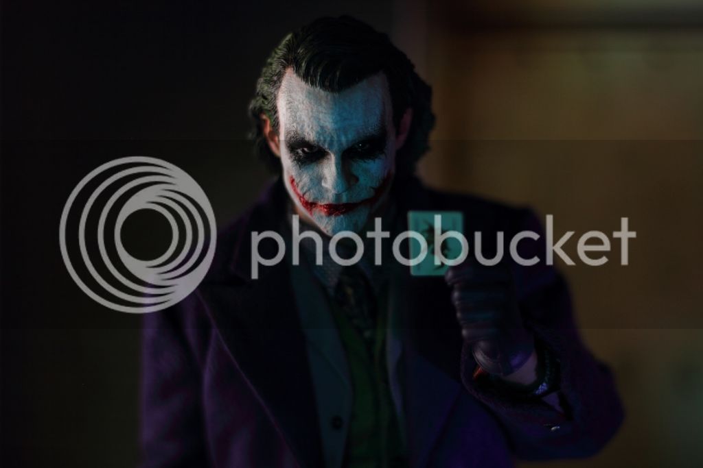
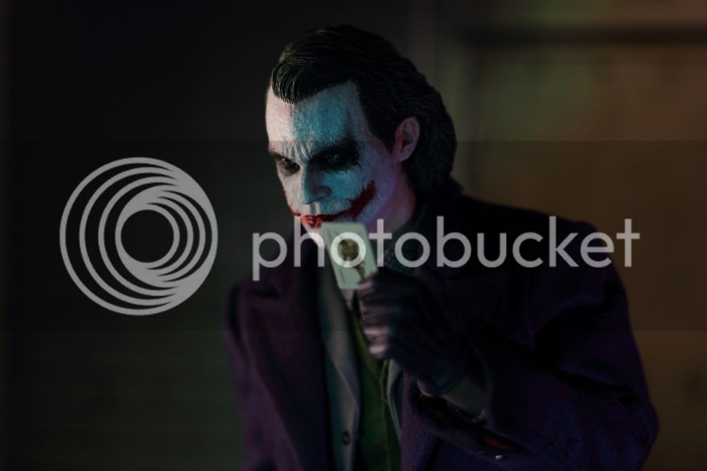
Excellent pics Thrustmaster!!! As always, your pics as breathtaking.
I agree with you completely.
That is why I have suggested LED lighting to several people before.
LED lighting is the difference between having a sculpt look like a toy to a museum looking piece.
Also, just because there is also LED lighting doesnt mean just stick it in the shelf.
You have to find the "SWEET SPOT".
Specially on something like this that has a transparency.
When I put my Joker directly underneath the LED lighting, the face is too "White" that you almost cant see the contrast between the white paint and flesh.
But as I move him a little further back, you now start to see the contrast and more flesh coming through. If you move it way at the back, now the white paint looks too muddy. Its all about finding that "SWEET SPOT" in the shelf.
Also, my feelings were the same regarding the initial impression. I kept going back and forth from wanting to cancel my order, to getting an unpainted sculpt, to wanting it again. And with some of the earlier batches, I was almost wishing I cancelled.
Then when I opened it, it wasnt exactly mindblowing, but my initial reaction is that it looks much better than I thought.
But once he is on the shelf, all futz and with a nice lighting, that's when you can really see that it is pretty much very close to the proto that I wanted.
And as I mentioned on my previous post, the more I stare at it, the more I really start to love it!
Once again man, very impressive Review and pics buddy!
Thank you buddy so much for your kind words. And absolutely agreeing with you. Without the LEDs, i wouldn't enjoy this hobby that much as i'm doing now. When i take them out of my display cabinet, i'm always a bit "shocked", but when i'm putting them back and the lights starts, i just feel again that museum quality
And i've gone a similiar time like you, i was also many times to cancel this, i just didn't like the whole procedure, was very much concerened about how this will look at the end, damn, i was even afraid to open the package after i've got it in my hands. For such a high-end piece and so much money involved, there happened just too many stuff around, that i didn't like. But at the end, i like the sculpt. From certain angles it looks dead on, from the front not so. Same goes with the paint, under special lightning it looks very good, under daylight not really.
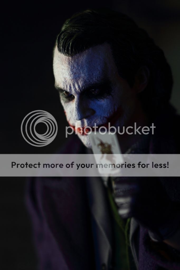
And here another shot:

and while talking about the front look and the lack of the likeness. i've looked at it a lot now, and i think of seeing what it is, that throws the likeness off. The chin is pointed too much out. If you fill the jaw a bit, it would have been better. also the scars, the eyes (should be a bit bigger), the nose and the hair on the side is just too full. especially in the combination with the pointed chin, the hair on the side looks just too much. I'm not a PS specialist, and i know it's too late to do any manips, but this is what i mentioned:

When i look now the right picture (which is the original untouched), it gaves me a Joaquin Phoenix vibe. Only the scar above his lips is missing


