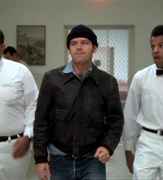
(Cult King) One Flew Over The Cuckoos Nest: R.P. McMurphy

Custom One-Sixth Figures Forum

Help Support Custom One-Sixth Figures Forum:

This site may earn a commission from merchant affiliate links, including eBay, Amazon, and others.
I agree on the skin tones. I think the eye color is ok. It needs to be a bit more greenish hazel. I think what's throwing it off is the teeth/upper lip area. The rest of the sculpt looks great.


Sent from my iPhone using Tapatalk
 
I don't like his forehead area, but otherwise really good.Except I'll prefer more confidence in expression.Now he looks bit like from end of story.


Sent from my iPhone using Tapatalk
 
Matt, I agree, the mouth is throwing it off for me. Maybe it is the tilted angle, but something is off in the mouth area.
I agree on the skin tones. I think the eye color is ok. It needs to be a bit more greenish hazel. I think what's throwing it off is the teeth/upper lip area. The rest of the sculpt looks great.


Sent from my iPhone using Tapatalk
 
Matt, I agree, the mouth is throwing it off for me. Maybe it is the tilted angle, but something is off in the mouth area.

Yep bottom of nose on up is great. The lip and teeth are off. I think the chin/jaw area could be thinner too. As someone pointed out on Facebook it seems they are having problems with their casting. The master looks great and then when the casts are made there's distortion


Sent from my iPhone using Tapatalk
 
The naked / bare sculpt was magnificent.
b6042be14befec271c859d60635c259e.jpg


Either it was warped in casting OR the paint is throwing it off along with unflattering phone photos. To be honest I think it's the paint. Iminime's Mad Max Mel was a let down, guys got it in hand and it had a lot of issues right off the bat. I seen the sculpt repainted by Jake and it's amazing, you guys know the one. It proves under a seemingly poor Gibson likeness was a great sculpt by iminime team. It was the paint throwing it off. Check out these side by side comparisons. (Posted them few months ago aswell) These unpainted sculpts are expressing better likeness, and liveliness than their painted prototype (Vito is final product) counterparts. For me paint should upgrade and enhance the likeness and add life.

fba76bc2bafa40101eeb5b31ced6c183.jpg


818871236d34b58ca66b508d0a3ff274.jpg


0f553efd7b63eca115ffb2426fe4a548.jpg


5d2622f0677d4ce4ba98e18a59c81154.jpg


I think it proves Iminime has some of the best likeness's. I think Good old Jack is no exception and with proper photography and better paintjob he could be really something. I say Iminime needs to revise their painting technique. They'd get more business, from me, anyway.


Sent from my iPhone using Tapatalk
 
Perfect example when you look above at the two photo's of the Redford. The unpainted sculpt looks great with cheekbones and depth to the face. The painted sculpt shows no definition and the face looks full and round.
 
Yep bottom of nose on up is great. The lip and teeth are off. I think the chin/jaw area could be thinner too. As someone pointed out on Facebook it seems they are having problems with their casting. The master looks great and then when the casts are made there's distortion


Sent from my iPhone using Tapatalk
Yes, nose up is great, below the nose needs some work. If you look at the photo's on the first page (the real Jack), his upper lip is pretty much straight across. The painted sculpt has the upper lip wavy with a sharp edge to it.
 
Wait a minute, not trying to derail this thread.
But didn't Caine do an awesome beanie version of this head already for a customer
who plans on making it available?

I guess you could get both if you really wanted the beanie look as well.
 
Last edited:
Wait a minute, not trying to derail this thread.
But didn't Caine do an awesome beanie version of this head already for a customer
who plans on making it available?

I guess your could get both if you really wanted the beanie look as well.

He never did though.

It looks like something happened to this in casting. Shame - it's not as good as the unpainted.
 
VERY QUICK PHOTOSHOP...

I think the bags under the eyes are too heavy.
And the teeth don't need such a hard separation line between.
I softened the cheeks also and made mouth slightly bigger

dc4a27f9c2b05e6019218db892f7bd71.jpg
 
It's the upper lip. Cover the mouth with something when looking at the picture, and it looks great. If you cover above the lip, it looks way off in likeness to Nicholson.
 
The naked / bare sculpt was magnificent.
b6042be14befec271c859d60635c259e.jpg


Either it was warped in casting OR the paint is throwing it off along with unflattering phone photos. To be honest I think it's the paint. Iminime's Mad Max Mel was a let down, guys got it in hand and it had a lot of issues right off the bat. I seen the sculpt repainted by Jake and it's amazing, you guys know the one. It proves under a seemingly poor Gibson likeness was a great sculpt by iminime team. It was the paint throwing it off. Check out these side by side comparisons. (Posted them few months ago aswell) These unpainted sculpts are expressing better likeness, and liveliness than their painted prototype (Vito is final product) counterparts. For me paint should upgrade and enhance the likeness and add life.

fba76bc2bafa40101eeb5b31ced6c183.jpg


818871236d34b58ca66b508d0a3ff274.jpg


0f553efd7b63eca115ffb2426fe4a548.jpg


5d2622f0677d4ce4ba98e18a59c81154.jpg


I think it proves Iminime has some of the best likeness's. I think Good old Jack is no exception and with proper photography and better paintjob he could be really something. I say Iminime needs to revise their painting technique. They'd get more business, from me, anyway.


Sent from my iPhone using Tapatalk
I think this is spot on. Although the paint application is fantastic on Iminime stuff - It doesn't capture the likeness and unfortunately sometimes really throws the sculpt off. Such amazing sculpts - Including Cuckoo here. It must be the paints to come out that differently.
 
Re: (Cult King) Goddamn Marvel Of Modern Science (McMurphy)

Interested!
This outfit should be the regular version.

25831525404_5f59e7be1d_z.jpg


The white scrubs with laughing sculpt can be the DX.
If we can only get one sculpt then I would like the above pic but with a smirk.

Interested in this


Sent from my iPhone using Tapatalk
 
Back
Top